Tips for Choosing Calm Colors to Create a Relaxing Home
Creating a peaceful and relaxing atmosphere in your home often starts with the colors you choose. Calm colors promote tranquility, reduce stress, and make your living spaces feel welcoming and restful. Whether you’re repainting a single room or planning a whole-home refresh, understanding how to select soothing tones can transform your environment.
In this post, we’ll explore practical tips on choosing calm colors for your home that encourage relaxation and harmony.
Why Choose Calm Colors?
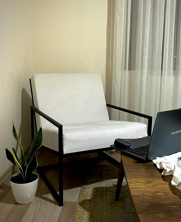
Colors have a strong impact on mood and perception. Bright or intense colors may energize a space but can also create a sense of tension if overused. On the other hand, calm colors like soft blues, greens, and neutrals help lower anxiety and invite a sense of comfort.
Using calming tones is especially beneficial in areas where you unwind—such as bedrooms, living rooms, and reading nooks.
Popular Calm Color Families
Before diving into choosing specific colors, let’s look at some calming color families that consistently work well in home settings:
Soft Blues
Blue hues are often associated with calmness, stability, and serenity. Soft blues can remind us of clear skies or peaceful water, enhancing the tranquil vibe in your space.
Gentle Greens
Green connects to nature and growth, making it a perfect calming color. Softer shades of green evoke a restful natural environment and are easy on the eyes.
Warm Neutrals
Warm beige, taupe, and soft greys create a cozy and grounding atmosphere without overwhelming the senses. These hues pair well with almost any decor style.
Muted Pastels
Pale lavender, blush pink, and light mint can add subtle color without overpowering the room, adding gentle warmth and calm.
Tips for Choosing the Right Calm Colors
Here are some strategies to help you select the calm colors that best suit your home and personal style:
1. Consider the Room’s Purpose
Think about how you will use the room. Bedrooms and meditation corners benefit from cooler blues and greens that support relaxation. Living rooms may welcome warm neutrals or pastel shades that foster comfort and social connection.
2. Pay Attention to Lighting
Natural and artificial light affects how color appears on your walls. Test paint samples at different times of the day to see how the color changes in sunlight and lamp light. A shade that looks calm in the morning might feel cold or dull in the evening.
3. Start Small with Samples
Before committing to an entire room, apply paint samples on small wall sections. Live with these swatches for several days to make sure the colors feel right.
4. Use Color Combinations Wisely
Pairing calm tones together can elevate the feeling of serenity. For example, a pale blue wall accented with soft beige furniture creates balance. Avoid very bright or contrasting colors nearby that could disrupt calmness.
5. Think About Your Existing Decor
Choose calm colors that complement your furniture, flooring, and accessories. If you have a lot of wooden tones, warm neutrals or muted greens will blend nicely. For more modern interiors, soft greys or pastel blues can bring calmness without clashing.
6. Create Texture and Layers
Calm colors don’t have to be flat or boring. Incorporating different textures with fabrics, rugs, and finishes enhances a room’s depth while maintaining its peaceful feel.
7. Trust Your Instincts
Ultimately, the best calm color is the one that makes you feel peaceful. Personal preference matters. If a shade resonates with you and soothes your mind, it’s a great choice.
Easy Ways to Add Calm Colors to Your Home
Not ready to repaint? Here are simpler options for introducing calm colors:
– Accent walls: Choose one wall to paint in a calming color to set the tone without overwhelming the room.
– Soft textiles: Add pillows, curtains, or throws in gentle blues, greens, or neutrals.
– Artwork: Select prints featuring calming hues or serene landscapes.
– Plants: Greenery naturally adds soothing color and freshness.
– Decor accessories: Vases, lamps, and rugs can introduce calm shades subtly.
Common Calm Color Mistakes to Avoid
– Choosing too dark a shade: Dark colors can create a cozy feel but may become heavy or gloomy if overused.
– Ignoring undertones: Colors have warm or cool undertones that affect mood. Make sure the undertone suits the room’s light and your preference.
– Using too many colors: Stay with a limited color palette to avoid visual clutter.
– Neglecting maintenance: Some calm colors, especially lighter shades, can show marks easily, so plan for upkeep.
Final Thoughts
Selecting calm colors is an excellent way to cultivate a relaxing atmosphere tailored to your lifestyle. By considering the room’s function, lighting, and your personal tastes, you can create a harmonious space that restores and refreshes.
Take your time testing samples and layering textures. With these tips, your home can become your peaceful sanctuary where calm colors invite rest and rejuvenation every day.